

” or “Access denied”")


 Learning Guide")


 in SharePoint Online Modern Pages")


Nowadays, it’s crucial that your webpages are responsive. The problem we sometimes run into, is the fact that some components don’t adapt well into mobile.
In this post, we’ll look at a way to make scrollable components more intuitive on mobile devices using CSS scroll shadows.
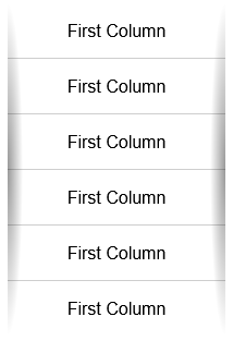
Let’s think of a table. It’s a collection of rows with columned data. One way to make a table responsive is by collapsing each row into a card. This will, however, remove the link between rows for any given column.
An alternative is to make the table scroll horizontally. This gives your data space to breathe and maintains the link given by columns. All done and pretty easy, right? Well, you might run into this problem:

If your column width happens to match the width of the table element, your users will have no idea that there is extra content to the side.
Adding Shadows
One way to fix this is by using scroll shadows. A scroll shadow is a shadow applied at the border of the element when there is the possibility of scrolling. That same example with a scroll shadow might look like this:

As you can see, the shadow is only visible when there is space to scroll. There are many ways to do this, I’m going to show you a way that only uses CSS.
First, we start by adding the shadows with two radial gradients.
.scroll-shadows-h {
  background:
    radial-gradient(farthest-side at 0 50%, rgba(0,0,0,0.4), rgba(0,0,0,0)),
    radial-gradient(farthest-side at 100% 50%, rgba(0,0,0,0.4), rgba(0,0,0,0)) 100% 0;
  background-repeat: no-repeat;
  background-size: 14px 100%, 14px 100%;
}
Hiding the shadows
This results in the shadows being visible even when there isn’t space to scroll. To fix this, we add shadow covers that hide the shadows at the beginning and end of the element, instead of its viewport.
We can implement this using the background-attachment property. To quote the MDN, “The background-attachment CSS property sets whether a background image’s position is fixed within the viewport, or scrolls with its containing block”.
Setting the background-attachment of the shadow covers to local, means that they are fixed relative to the content of the element. When we scroll inside the element, the background scrolls as well.
.scroll-shadows-h {
  background:
    /* Shadow covers */
    linear-gradient(to right, #fff 30%, rgba(255,255,255,0)),
    linear-gradient(to right, rgba(255,255,255,0), #fff 70%) 100% 0,

    /* Shadows */
    radial-gradient(farthest-side at 0 50%, rgba(0,0,0,0.4), rgba(0,0,0,0)),
    radial-gradient(farthest-side at 100% 50%, rgba(0,0,0,0.4), rgba(0,0,0,0)) 100% 0;
  background-repeat: no-repeat;
  background-size: 40px 100%, 40px 100%, 14px 100%, 14px 100%;
  background-attachment: local, local, scroll, scroll;
}
This class is the class used in the example in the image above. The cool thing about this implementation is that it’s very versatile. We can apply it vertically or use any background we want to. You could replace the shadows with an image (e.g. an arrow) and this effect would still work, as the covers will continue to overlap it. Check the CodePen below for some examples!
Thanks for reading! Do you find this useful? Do you think there are better ways to achieve this effect? Let me know in the comments below, or reach out to me on Twitter @pedronavelopes!
This blog post was inspired by Lea Verou’s post “Pure CSS scrolling shadows with background-attachment: local“. Go check it out!


