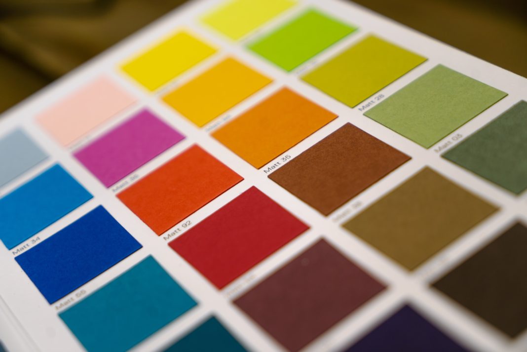
When you have a theme based on a color picked by your users, it can be hard to find intermediate values for things like hover and active states, or even colors that look or contrast well together.
There are currently some convoluted ways of doing this, using CSS filters to change brightness or contrast, or using CSS variables to separate each of the color’s values and use the calc function to manipulate them.
With the CSS Color Module Level 5, there are some great new features that will make this manipulation much easier to achieve.
Keep in mind, these features are not yet widely supported by browsers, being either experimental or hidden behind flags. Hopefully, these will start to roll out during this year.
Color spaces
Before getting into color manipulation, one other feature that will improve the results of dynamic color palettes are color spaces.
Color spaces essentially determine how colors are defined and how they can be represented. The CSS Color 4 introduces a bunch of ways to define colors, one of them being Lightness Chroma Hue (LCH). LCH introduces many improvements over RGB, such as more colors and more uniformity. For more detail on this, I recommend Lea Verou’s blog post “LCH colors in CSS: what, why, and how?”.
Color mix
The color-mix function lets us mix two colors with a given weight to each. You can mix the theme color with white or black to make it lighter or darker, or mix it with the secondary color to get interpolated values between them.
color: color-mix(in srgb, var(--primary-color) 70%, white);
color: color-mix(in srgb, var(--primary-color) 70%, black);
color: color-mix(in lch, var(--primary-color), var(--secondary-color));
Resources:
Relative colors
With relative colors, you can define color values based on a given color, and change the individual values that make up that given color. Remember the approach I mentioned above that separates each of the color’s components into a CSS variable? This blog post by Jim Nielsen compares the two approaches.
// Reduce the primary color transparency
color: rgb(from var(--primary-color) r g b / 80%);

// Reduce the lightness using the LCH color space
color: lch(from var(--primary-color) calc(l / 2) c h);
Resources:
Color contrast
With the color-contrast function, we can let the browser automatically determine a color that contrasts with a given color and matches accessibility requirements.
At its simplest, the function receives a color value (typically the background color) and returns either white or black, depending on which has better contrast.
If you want custom contrast colors instead of black or white, you can provide a list of colors to pick from (using the vs keyword), and the color with the highest contrast will be chosen. As a backup, you can define a contrast target (using the to keyword) and if no color matches that contrast, white or black will be picked. The contrast target can be given as a number or as a level from WCAG (AA, AA-large, AAA, and AAA-large).
// Chooses black or white based on which has better contrast
color: color-contrast(var(--bg-color));

// Chooses a contrasting color from a given list (after the "vs"), that result in  a contrast level of at least AA. If none match, picks white or black
color: color-contrast(
	var(--bg-color)
	vs
	var(--text-color),
	var(--text-color--light),
	var(--text-color--lightest),
	to AA
);
Resources:
Conclusion
The future is looking bright for dynamic color themes in CSS. We will soon be able to move away from convoluted hacks and start using native functions.
Do you find these color features useful? How do you get around this currently? Do you know of any other features that you think help with this topic? Leave a comment or reach out to me on Twitter @pedronavelopes.


![[FIX] BizTalk Server 2010, 2013, 2013 R2 & 2016 errors “Class not registered (WinMgmt)” or “Access denied”](https://blogit.create.pt/wp-content/uploads/2018/07/access-black-and-white-blur-270514-218x150.jpg)


